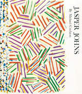
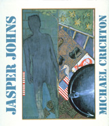
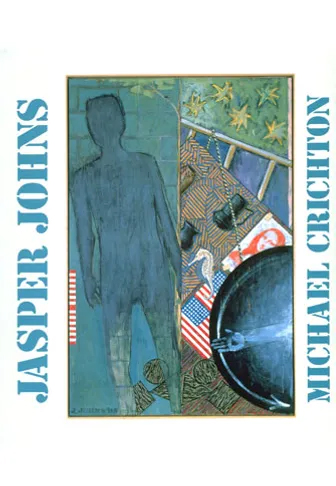
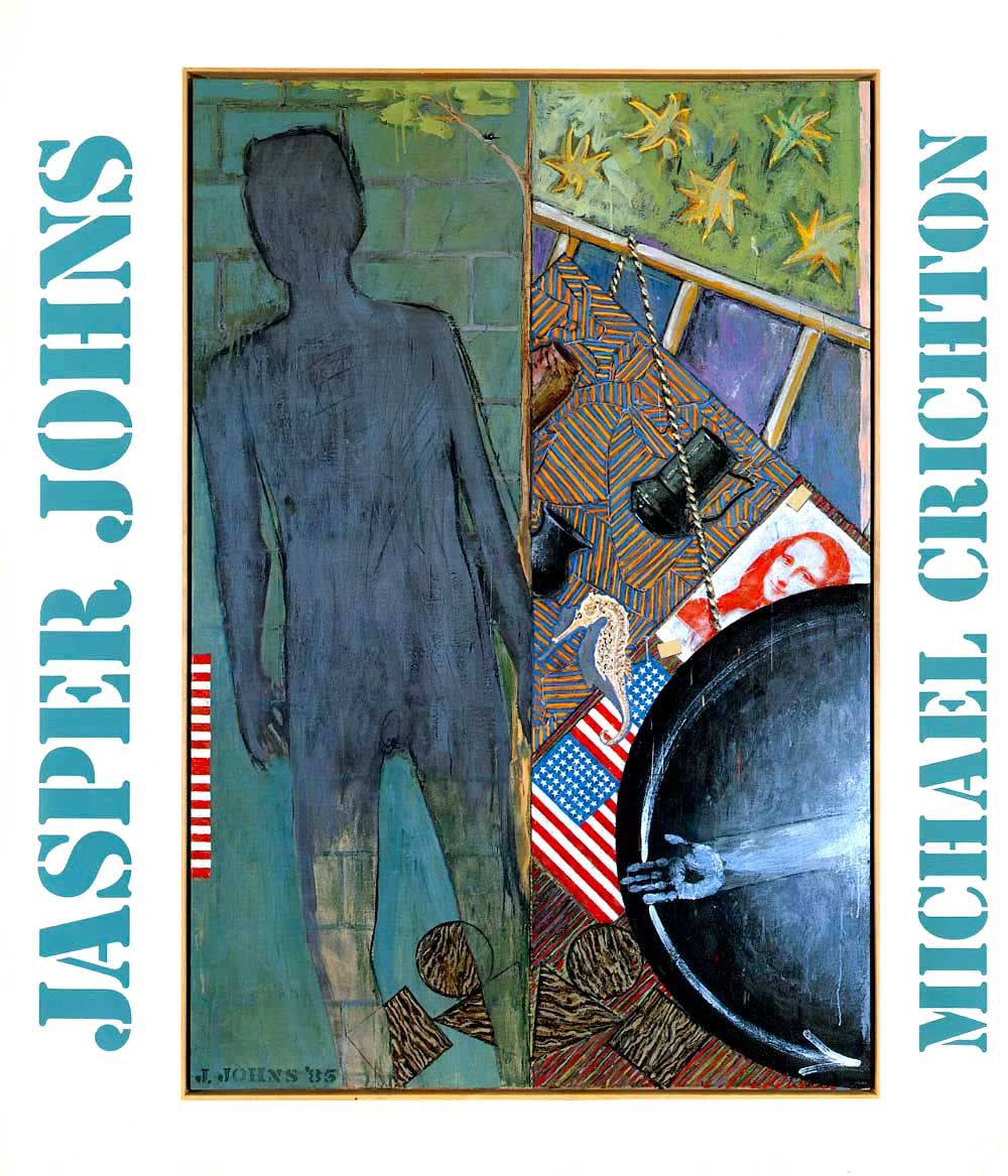
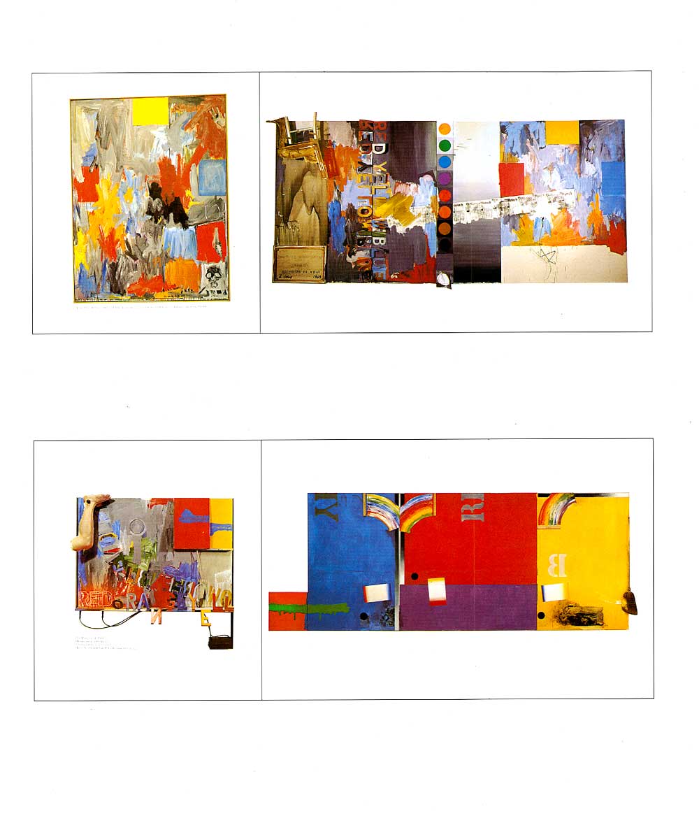
Jasper Johns
In His Own Words
In 1976, the Whitney Museum asked me to write the catalog text for an upcoming retrospective of the painter Jasper Johns. I agreed to do it because I knew Johns slightly, and he was in those days very reclusive and mysterious. I figured if I wrote the catalog, he would have to answer all my questions.
Before I began writing, I asked people which exhibition catalogs they had read, and liked. It turned out nobody had ever read any catalog. Sometimes people had started to read, but then quit. But then, when I thought about it, I had never read a catalog, either.
So I asked, if you were to read a catalog, what would you want it to tell you? The answer that came back was unanimous, and surprising to me. They wanted to know something about the artist, what kind of a person he was. And then something about the background to the pictures—how they came to be painted, what was going on in the artist’s life at the time. And nothing else— “none of that art interpretation stuff,” as one person put it.
It was clear: they wanted information. They’d do the interpretation for themselves.
So that’s what I did.
In 1989, the publisher Abrams told me the book was still in print, and that they would like to issue a new edition, incorporating recent work by Johns. I was glad to do it, because I had conceived the original catalog text as something of the moment-something bound to a particular moment in 1976-and not something that would still be around fifteen years later, where its context in time was lost. There were several passages in that book that I considered to be more about me, and the way I think about work, than about Johns. So I took them out, and brought the book up to date.
Now it’s twelve years later again, and Johns’ work has taken a new direction in the last few years. So I suppose it might be time for a third revision.


Synopsis
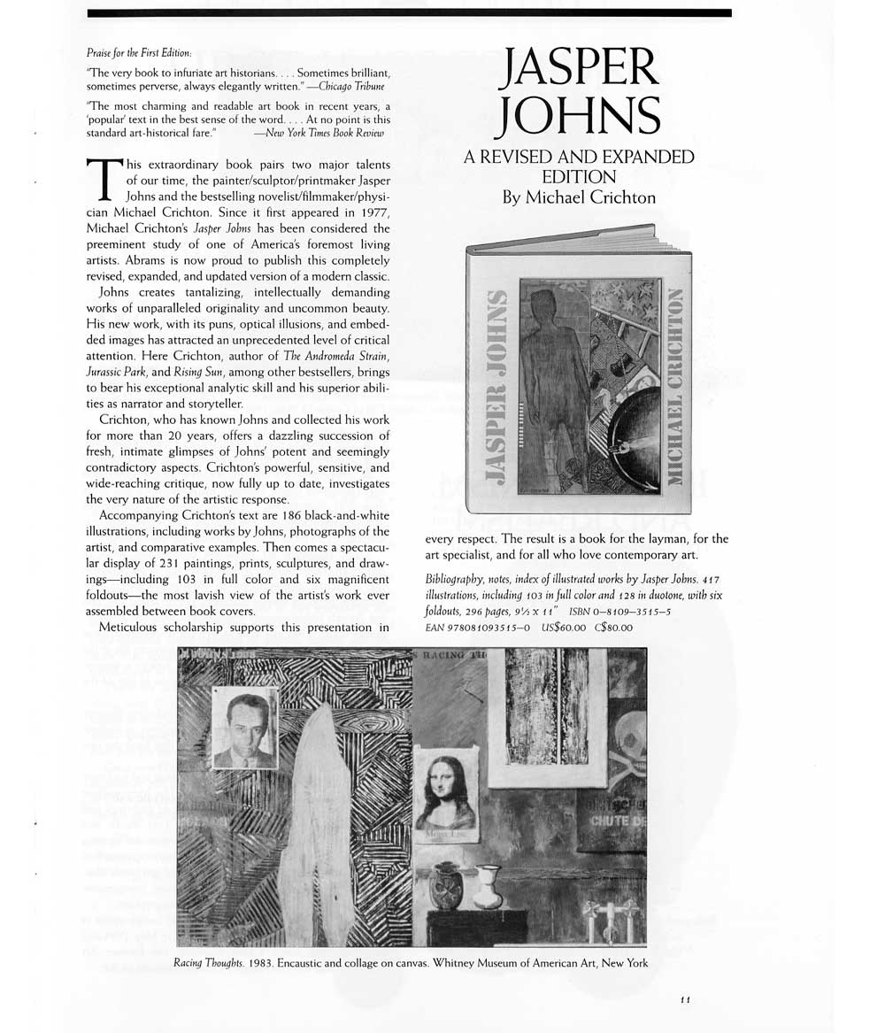
Jasper Johns has often been called an “artist’s artist.” In his use of found objects and commonplace imagery, he creates tantalizing, intellectually demanding works of unparalleled orginality and uncommon beauty. His new work, with it pun, optical illusions, and embedded images ranging from George Ohr pots to the “Isenheim Altarpiece” to Picasso etchings, has attracted an unprecedented level of intense critical attention.
Crichton, who has known Johns and collected his work for more than twenty years, offers a dazzling succession of intimate glimpses of John’s potent and seemingly contradictory aspects, many of them highlighted by interviews with the artist, his dealers, and distinguished contemporary critics. He also conducts a powerful, sensitive, and wide-reaching cirtique of John’s work – and in so doing offers an intriguing investigation into the very nature of the artistic response.
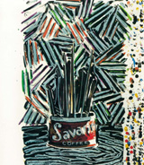
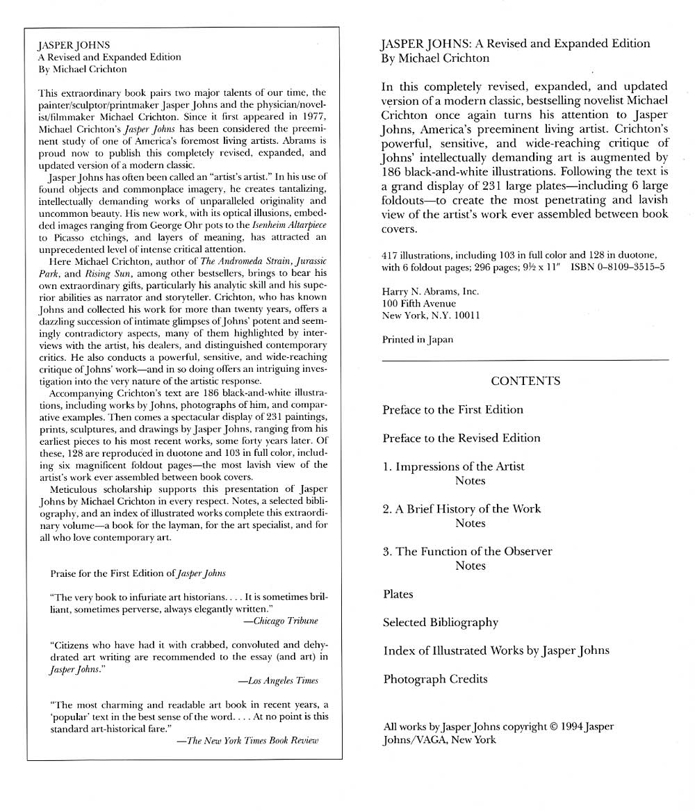
Accompanying Crichton’s text are 186 black-and-white illustrations, including works by Johns, photographs of him and comparative examples. Then comes a spectacular display of 231 paintings, prints, sculptures, and drawings by Jasper Johns, ranging from his earliest pieces to his most recent works, some forty years later. Of these, 128 are reproduced in duotone and 103 in full color, including six magnificent foldout pages – the most lavish view of the artist’s work ever assembled between book covers.
Meticulous scholarship supports this presentation of Jasper Johns by Michael Crichton in every respect. Notes, a selected bibliography, and in index of illustrated works complete this extraordinary volume – a book for the layman, for the art specialist, and for all who love contemporary art.
Passage 1
From Jasper Johns
The art critic Leo Steinberg has recorded another conversation: “I asked [Johns] about the type of numbers and letters he uses – coarse, standardized, unartistic – the type you associate with packing cases and grocery signs.
Q: You nearly always use the same type. Any particular reason?
A: That’s how the stencils come.
Q: But if you preferred another typeface, would you think it improper to cut your own stencils?
A: Of course not.
Q: Then you really do like those best?
A: Yes.
This answer is so self-evident that I wonder why I asked the question at all; ah, yes – because Johns would not see the obvious distinction between free choice and external necessity. Let me try again:
Q: Do you use these letter types because you like them or because that’s how the stencil’s come?
A: But that’s what I like about them, that they come that way.”
A Johnsian conversation may seem frustrating, but the artist is not being difficult. Quite the contrary: he struggles to find the plainest way of talking about a situation. His friend, the composer John Cage, recalled sitting on a porch at Johns’ house in South Carolina, with “records filling the air with rock-n-roll. I said I couldn’t understand what the singer was saying. Johns (laughing): That’s because you don’t listen.”
Passage 2
From Jasper Johns
“How do you work on a painting?”
“Well, I begin at the beginning, and go on from there.”
Once I drove him from his house at Stony Point into New York City. We were going to some destination I did not know. I asked him how to get there. “Well, I’m not sure, I’ll know when I see it, as we go.”
We drove for a while longer, crossing the George Washington Bridge. I asked again. “Well, I don’t know. Turn right here, and we’ll figure out the rest later.”
I became frustrated. I like to know where I am going, I like to plan ahead. He stays firmly in the present: we are going down this street now, and when we get to the end, we will decide which way to turn, and having decided that, we will wait until it is time to make another decision.
We chatted about his family; he was relaxed, I was going crazy. But we finally arrived. We began at the beginning and went on from there.
Passage 3
From Jasper Johns
In 1954, Johns had a dream in which he saw himself painting a large American flag. Soon after, he did his first one, in encaustic. He recalls thinking: “It was something I could do that would be mine.” Paradoxically, in that impersonal image, the young artist found his self-identity.
Painting a flag triggered many related ideas. “Using the design of the American flag took care of a great deal for me because I didn’t have to design it. So I went on to similar things like the targets – things the mind already knows. That gave me the room to work on other levels.”
This sense of the “other levels” is critical to Jasper Johns’ method of operation. If he does not create an image, but uses ready-made designs, images, and lettering, what does his work consist of?
We have a clue in a further elaboration: he considers the flags and targets similar because “they’re both things which are seen and not looked at, not examined, and they both have clearly defined areas which could be measured and transferred to canvas.”
There are two ideas here: first, the notion of an image which is seen and not seen, because of its familiarity. And second, the idea of an image which can be precisely measured and put onto canvas – an object identified by its fixed proportions. An accurately reproduced flag is familiar; and therefore, “not looked at.” But by painting the image in encaustic, with its heavily worked, encrusted surface, Johns’ flag image becomes familiar and unfamiliar at the same time, and therefore draws our notice.
From the Archives
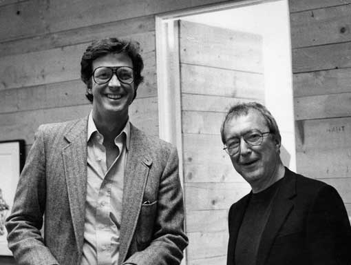

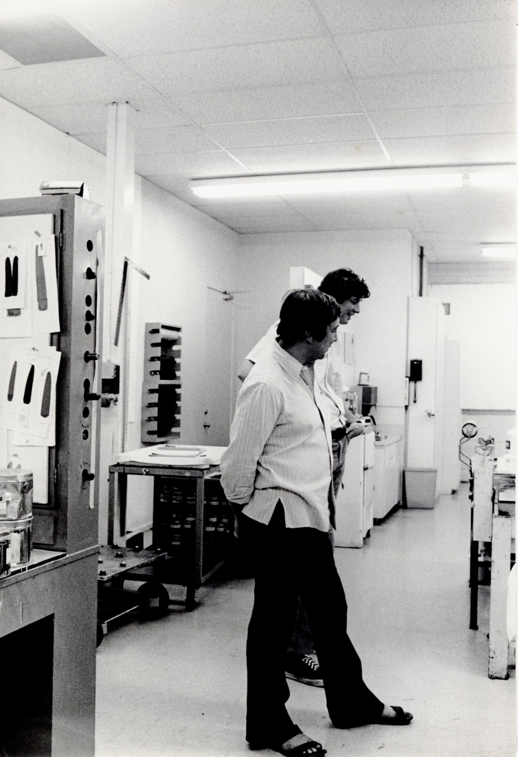

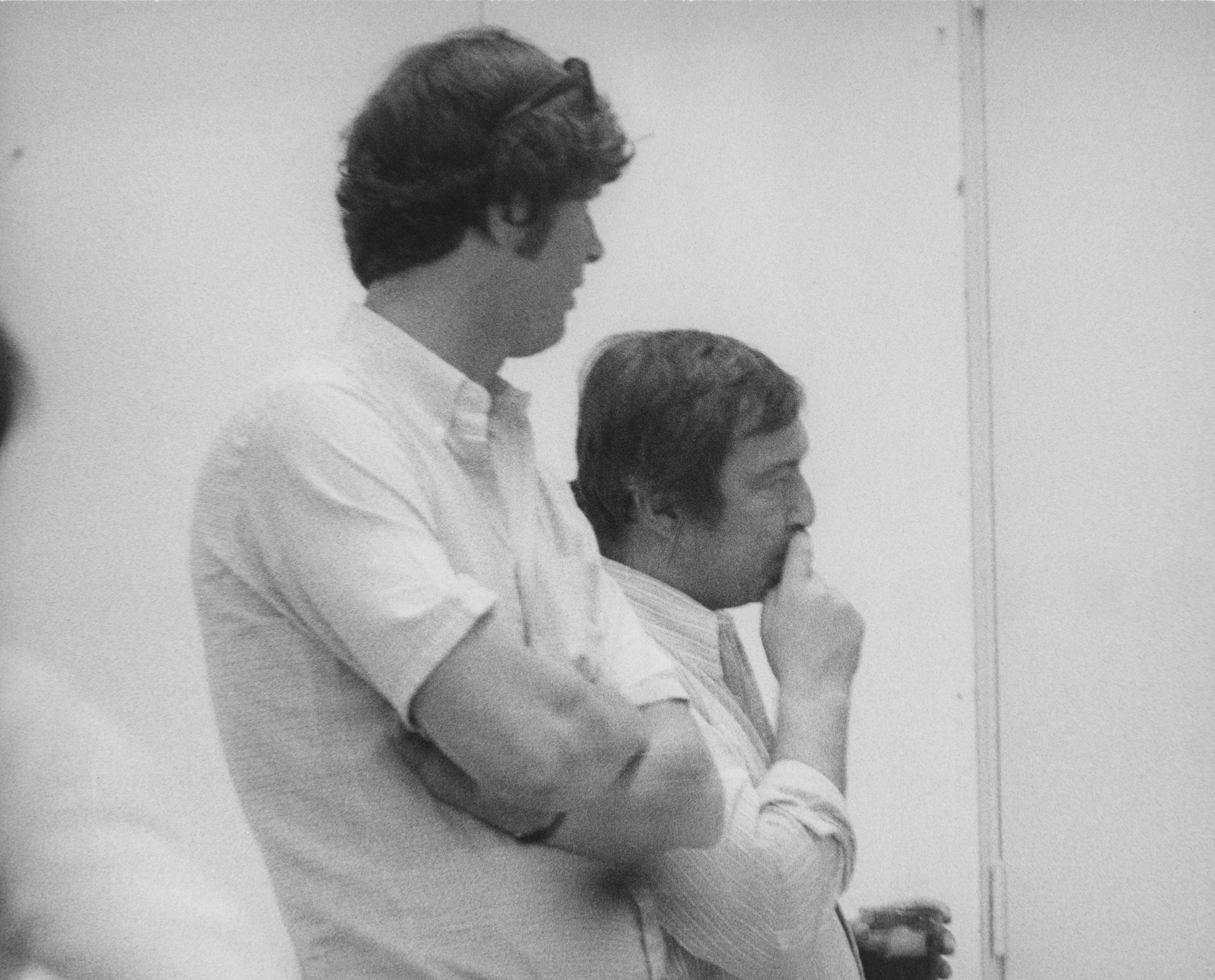




In His Own Words
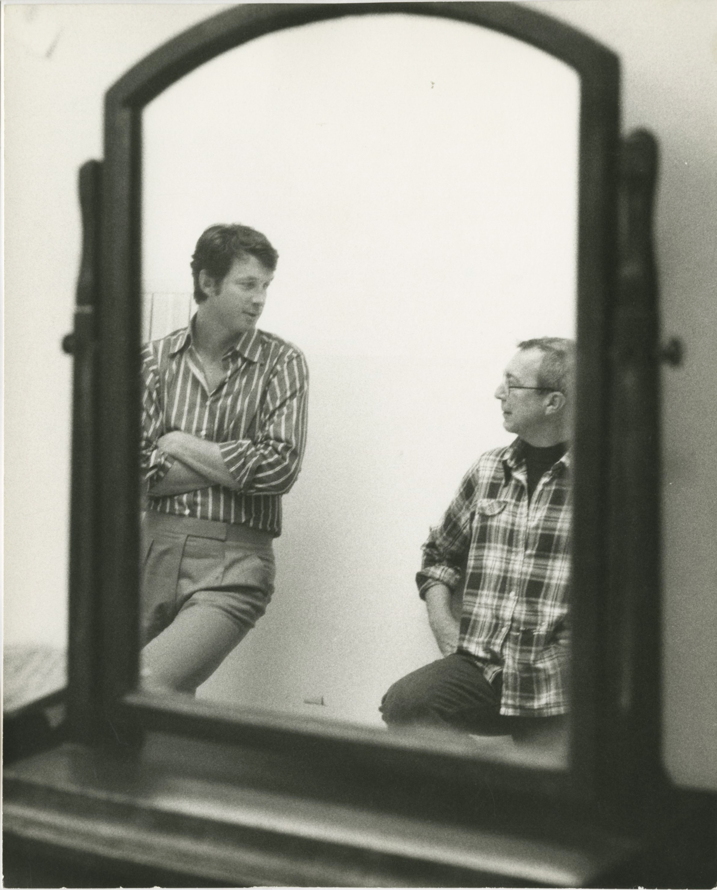
He [Jasper Johns] does very beautiful work. He’s an extremely interesting person to be around and his work I find challenging on many levels—it’s intellectually challenging, it’s visually challenging, and it rewards continued looking. You can have a piece of his work up for years and look at it and keep seeing new things and having new feelings about it. Not all artists are like that—in terms of their work.
Book Covers
